Virtual Apartment Staging Ideas That Actually Help Empty Listings
Practical virtual apartment staging ideas for empty listings, with tips on room purpose, buyer fit, and believable styling choices that support faster marketing.
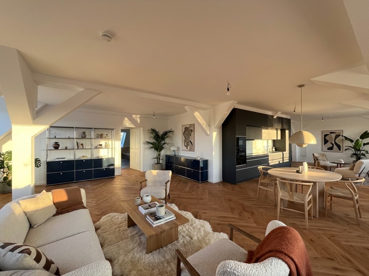
Most empty apartments do not need more decoration. They need more clarity.
That is the difference between staging ideas that feel commercially useful and staging ideas that only make the image look busier.
Quick Answer
The best virtual apartment staging ideas usually do three things:
- make the room's purpose obvious,
- match the likely buyer and price tier,
- and keep the result believable enough that the listing still feels honest.
If the apartment is empty, the job is not to impress people with design for design's sake. The job is to help buyers understand the space faster online.
In This Guide
- Which rooms deserve staging first
- What kind of furnishing direction works best
- How to avoid over-staging
- A simple idea checklist before publishing
Start With the Rooms That Carry the Listing
Not every room has the same marketing weight.
For most apartment listings, the best first candidates are:
- the living area,
- the main bedroom,
- and occasionally a second room if the layout is hard to interpret.
These are usually the rooms where buyers need the most help imagining scale, circulation, and lifestyle.
Make the Room's Job Obvious
One of the strongest virtual apartment staging ideas is also the simplest: give each room one clear role.
That might mean:
- a living room that reads immediately as the social center of the apartment,
- a bedroom that feels calm and proportional,
- or a flexible second room that signals office, nursery, or guest use.
The more immediately the room reads, the more useful the staging becomes.
Match the Apartment Tier
A studio rental, a mid-market city apartment, and a premium urban listing should not all receive the same furnishing language.
Good staging direction should reflect:
- the likely buyer or renter,
- the expected price bracket,
- the neighborhood tone,
- and how polished the listing needs to feel.
If the staging looks more expensive than the property itself, buyers will feel the disconnect.
Use Less Furniture Than You Think
Over-staging is one of the most common mistakes.
Too much furniture can:
- shrink the room visually,
- make circulation feel tighter,
- and make the result look artificial.
In many apartments, lighter furnishing density does a better job than a fully packed interior.
Add Warmth Without Changing the Room
Strong virtual apartment staging ideas usually work through context, not structural fantasy.
The safest improvements are often:
- seating that shows scale,
- lighting and textiles that soften the room,
- a dining setup that clarifies layout,
- and decor that helps the image feel inhabited without becoming noisy.
This is also the more trustworthy direction for real estate marketing.
A Simple Checklist for Better Apartment Staging Ideas
- Does the room purpose read instantly?
- Does the styling match the apartment tier?
- Does the furniture fit the room scale?
- Is the image warmer and clearer, not just fuller?
- Would a buyer still believe the room looks like this apartment?
The Practical Takeaway
The best virtual apartment staging ideas are not the most dramatic ones. They are the ones that make an empty apartment easier to understand, easier to imagine living in, and easier to trust.
If you want to test that on a real vacancy, see how Planua approaches virtual apartment staging, read how to improve empty room listing photos, and start with a free draft.
Try It On A Real Listing
Ready to turn empty room photos into listing-ready interiors?
Use this topic on a real listing and see how Planua fits your virtual staging workflow.
Keep Reading
Related virtual staging guides
virtual staging vs traditional staging
Virtual Staging vs Traditional Staging: When Each Makes Sense
Compare virtual staging and traditional staging across speed, cost, buyer clarity, and operational fit for real estate teams.
virtual staging for rental listings
Virtual Staging for Rental Listings: When It Helps Most
A practical guide to virtual staging for rental listings, including when it helps, which rooms to stage first, and how to keep the result believable for faster leasing marketing.
virtual staging software reddit reviews
Virtual Staging Software Reddit Reviews: What Agents and Photographers Say
A transparent analysis of Reddit discussions about virtual staging software, covering room accuracy, realism, consistency, pricing, review, and disclosure.